You have no items in your shopping cart.
New image for Hay Hampers to gain new markets
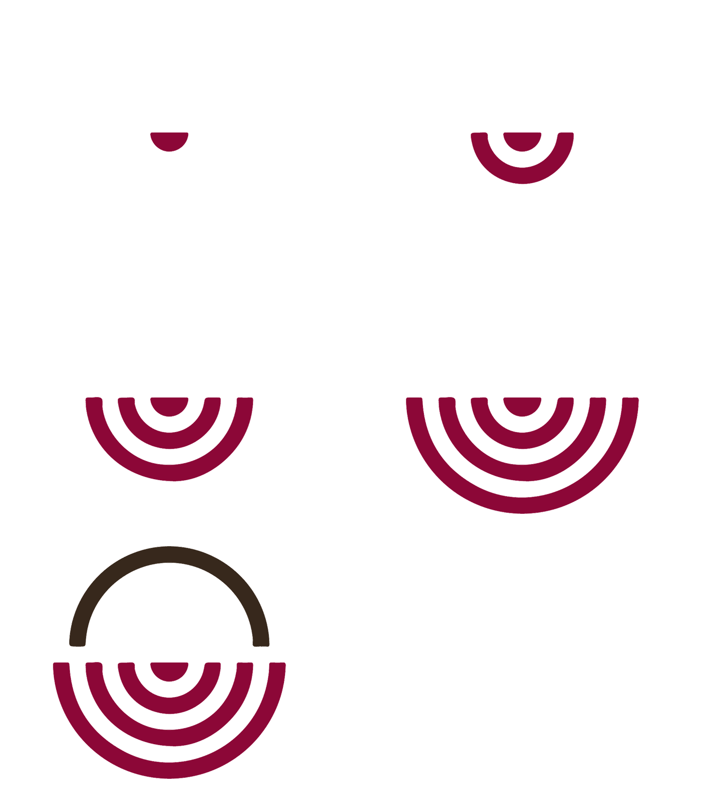
Hay Hampers is giving itself a makeover with a new logo and a new corporate image. A modern symbol that hints the shape of a gift hamper is the shape chosen by Hay Hampers to also attract an increasing number of younger customers and to approach foreign markets such as Germany especially over the Christmas season.
Hay Hampers’ new logo is looking to retain a simple, friendly and approachable style. Beside a geometrical shape representing a basket, the company name is written in the typeface Gotham Sans which is the same one used for Barak Obama’s presidential campaign and it aims to appear straightforward, uncluttered, and friendly. Whereas Hay Hampers 30-year-expertise in the hamper gift market is expressed by the Serif typeface of the tagline, which is more suited to convey a message of tradition, history and heritage.
The logo, which was created by the Italian agency O-Zone, is just one of the changes since the company was restructured last year. After last June’s relocation to bigger premises in Bourne Lincolnshire, Hay Hampers has launched a new, fully responsive e-commerce website set up by the international company Netribe Group.
Hay Hampers is hoping this update will stand the test of time and market. Gabriele Da Re, managing director at Hay Hampers Ltd, said: “We are not Google with its restyling of the logo. However, Hay Hampers is one of the UK's leading gift hamper companies, so it makes sense for us to be identified by a more contemporary mark. When Hay Hampers first rose to prominence, it was just a shop. The challenge for the company now is to address also younger customers with a larger, more sophisticated variety of food and wines, and to extend outside the UK to new, attractive markets, first of all Germany”.

